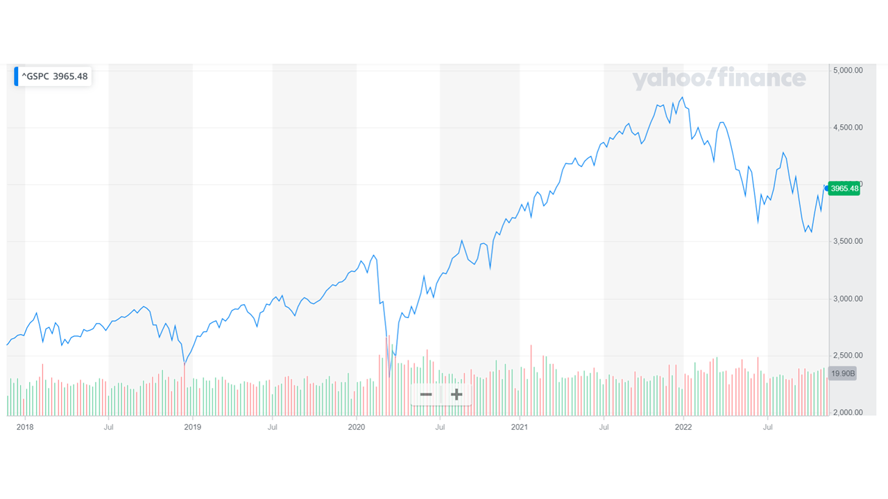
You can see the graph of the S&P 500 from 2018 to now. The dramatic March 2020 Covid dip that shows the slump and then the rapid ascent and then the sell off since the start of 2022.
You can see the graph of the S&P 500 from 2018 to now. The dramatic March 2020 Covid dip that shows the slump and then the rapid ascent and then the sell off since the start of 2022.